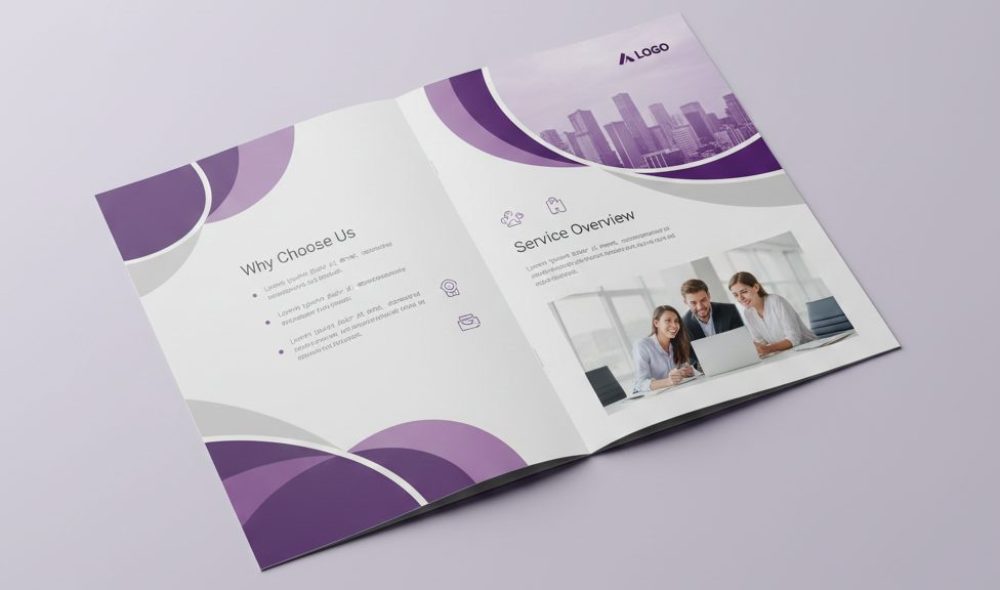
Brochures still exist for a reason. Even with phones everywhere, people still pick up printed pieces. A brochure is quiet, it does not blink or beep, it just sits there and waits. When someone opens it, the design and layout decide everything. If it feels confusing, the brochure closes fast. If it feels clear, the person keeps reading without thinking much.Brochure Printing is not only about ink and paper. It is about how information is shown. The way text sits on a page, the space between lines, the balance of images, all these things shape how a reader feels. Many businesses do not notice this at first. They focus on content and forget how it looks when printed.
Over time, smart businesses learned one thing clearly. Good design helps the message travel. Bad layout blocks it.
First Look Always Shapes Opinion
People do not read first, they look first. The eyes judge quickly, even before the brain tries to understand words. When a brochure looks heavy, crowded, or messy, the mind feels tired already.
In Brochure , first look matters more than long explanations. Colors, margins, and image placement talk silently. A clean look feels safe. A balanced look feels professional.
Some brochures get ignored not because they say something wrong, but because they look uncomfortable to read.
Layout Controls the Reading Flow
Layout works like a road. It guides eyes from one point to another. When the road is clear, the journey feels smooth. When it twists without logic, people stop.
In Brochure , layout decides what comes first and what comes last. Headline, details, benefits, contact information, all must appear in order. If order is broken, the reader feels lost.
Businesses doing Brochure Printing in Las Vegas often design for fast readers. People there move fast, think fast, decide fast. Layout must respect that habit.
Space Helps People Breathe
Not everything needs to be filled. Empty space helps the reader rest. White space makes content easier to absorb.
In Brochure , space around text increases clarity. It allows the eye to separate ideas naturally. Without space, everything feels loud.
Many beginners think space wastes paper. In reality, space saves attention.
Fonts Speak Without Sound
Fonts carry emotion. A heavy font feels strong. A thin font feels soft. Hard fonts feel cold.
It needs fonts that feel comfortable. Fancy fonts may look attractive but they slow reading. Simple fonts allow message to move faster.
A professional Las Vegas Custom Printing service often helps businesses avoid font mistakes. This small help changes the whole reading experience.
Color Choices Influence Feeling
Colors affect mood quietly. Red creates urgency. Blue feels calm. Green feels balanced.
In Brochure , color should support the message, not fight it. Too many colors confuse. Too few colors feel dull.
Wrong color choices can send wrong signals even when words are correct.
Images Explain Faster Than Words
Images talk fast. One image can replace many lines of text.
In Brochure , images should support the story. They should not distract or overload. Real images often work better than stock ones because they feel honest.
In busy markets like Brochure Printing in Las Vegas, images help catch attention quickly in crowded places.
Balance Keeps Attention Longer
Balance means text and images live peacefully together. No side should dominate too much.
In Brochure , balanced pages feel calm. The reader does not feel pushed or rushed. Balance increases reading time naturally.
Designers who understand balance create brochures that people finish instead of dropping.
Fold Type Changes the Story
Brochures fold in different ways. Each fold changes how information appears.
In Brochure , tri-fold, bi-fold, or z-fold designs need different layout planning. Wrong placement breaks the reading order.
A skilled Las Vegas Custom Printing provider often guides businesses to choose fold style that fits content properly.
Consistency Builds Trust Slowly
Consistency means same colors, same font style, same tone across all pages.
In Brochure , consistency helps recognition. When people see the same style again, memory connects faster.
Inconsistent layout makes the brand feel unsteady.
Paper Quality Supports Design
Design does not live alone. Paper carries it.
In Brochure , glossy paper makes colors pop. Matte paper feels soft and serious. Thin paper feels casual. Thick paper feels premium.
Paper choice affects how the brochure feels in hand, not just how it looks.
Headings Guide the Reader
Headings work like signboards. They tell readers what comes next.
In Brochure , clear headings reduce effort. Readers scan first, then decide where to focus.
Weak headings confuse and slow the reader.
Call to Action Needs Space
Every brochure wants action. Call, visit, book, attend.
In Brochure , call to action must be easy to find. It should not hide. Placement matters more than wording.
Businesses using Brochure Printing in Las Vegas often highlight contact details clearly because decisions happen fast.
Structure Improves Memory
People remember structured information better.
In Brochure, bullet points, short sections, and spacing help memory. Long paragraphs reduce recall.
Design helps memory by organizing content cleanly.
Printing Quality Finishes the Job
Design means nothing if printing fails.
Brochure printing needs sharp text, accurate colors, and clean cuts. Blurry images or dull ink kill trust.
A reliable Las Vegas Custom Printing service protects the design by delivering clean final output.
Human Touch Matters More Than Perfection
Perfect design sometimes feels cold. Slight imperfections feel human.
In Brochure , natural flow connects better than robotic symmetry. Humans trust what feels real.
Design should feel like a person speaking, not a machine.
Design Shows Brand Personality
Design speaks brand personality without words.
In Brochure , serious brands feel structured. Creative brands feel playful. Friendly brands feel open.
Design must match who the business really is.
Brochures Support Sales Talk
Sales teams use brochures during conversations.
In Brochure Printing, layout should help pointing and explaining. Sales people depend on clear sections.
Good layout makes selling easier.
Print Design Is Not Screen Design
Screen rules do not always work on paper.
Brochure Printing needs print margins, bleed space, and resolution planning. Ignoring this creates problems.
Print thinking matters.
Feedback Improves Design Over Time
Design grows with feedback.
In Brochure Printing, businesses who listen to customer reactions improve future versions.
Real use teaches more than theory.
Frequently Asked Questions
1. Why does design matter so much in Brochure Printing?
Design controls attention and reading comfort. In Brochure Printing, good design helps readers understand without effort.
2. Is Brochure Printing in Las Vegas different from other cities?
Yes, Brochure Printing in Las Vegas often focuses on fast clarity because people move quickly and see many materials daily.
3. How does Las Vegas Custom Printing help brochure success?
Las Vegas Custom Printing helps with paper choice, layout advice, and clean printing which improves final quality.
4. Can bad layout reduce brochure results?
Yes. In Brochure Printing, bad layout confuses readers and weakens message impact.
5. How important is paper quality?
Very important. In Brochure Printing, paper affects trust, feel, and brand image.
6. Do images really matter in brochures?
Yes. In Brochure Printing, images explain faster and hold attention longer when used correctly.
Final Thoughts
Design and layout are not decoration. They are communication tools. A brochure speaks before words are read. Layout guides understanding. Printing quality supports trust.
Brochure Printing works best when design feels natural and layout feels logical. When all parts work together, brochures do more than inform. They connect, they guide, and they stay remembered.


