
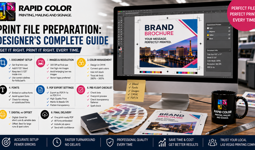
Most delayed print jobs are not delayed by presses. They are delayed by files. A missing font, a low-resolution logo dropped in from a website, artwork built in RGB, or a document supplied without bleed will stop a job at prepress and send it back to the designer, often costing a full production day. Solid print file preparation is the difference between a job that runs the hour it arrives and one that bounces twice before anyone inks a plate. This guide covers the checks that matter, in the order you should apply them. Files heading to digital printing in Las Vegas presses follow the same rules as plate work, with a few exceptions noted below.
What Does a Print-Ready File Actually Mean?
Print file preparation produces one thing: a file a printer can output without opening, editing, or interpreting anything. In practice that means a PDF with correct bleed and trim, all fonts embedded, all images at adequate resolution and in the right color space, and no live effects that could render differently on another machine.
The word “interpret” is the key one. Every time a prepress operator has to make a judgment call about your file, you lose control of the outcome. Disciplined print file preparation removes those judgment calls entirely, which is why experienced designers treat it as part of the design process rather than an administrative task at the end.
Document Setup: Get This Right Before You Design
Size, Bleed, and Safety Margins
Print file preparation begins before the first design decision. Set your document to the final trim size, then add bleed. The standard is 0.125 inches on every edge, extended to 0.25 inches on large-format work. Any element intended to reach the edge of the finished piece must extend into that bleed area, because paper shifts fractionally during cutting and a background stopping exactly at the trim line will show a white sliver.
Equally important is the safety margin. Keep all text and critical content at least 0.125 inches inside the trim line, and 0.25 inches on bound or folded pieces. Print file preparation failures at this stage are the most common cause of reprints, because nothing on screen warns you that a phone number sits too close to the edge.
Folds, Panels, and Perforations
Folded pieces are not simply divided by equal thirds. On a tri-fold, the inward-folding panel must be roughly 0.0625 inches narrower so it tucks cleanly. Supply a separate layer marking fold, score, and perforation positions, and label it clearly so it is not mistaken for artwork. Any competent las vegas printing company will provide a dieline template for non-standard formats on request, and using it removes the guesswork from print file preparation on folded work.
Images and Resolution
Effective resolution, not file resolution, is what matters in print file preparation. A 300 dpi image scaled to 200 percent in the layout is effectively 150 dpi and will print soft. Check the effective ppi in your layout application rather than trusting the original file.
For standard commercial work, print file preparation targets 300 dpi at final placed size. Large-format pieces viewed from a distance can drop to 100 to 150 dpi at full size without visible loss. Line art and logos should be supplied as vector wherever possible, since vectors scale infinitely and print with crisp edges at any size.
Never take images from a website. Screen graphics are typically 72 dpi and in RGB, and no amount of upsampling recovers detail that was never captured. This single habit accounts for a large share of print file preparation problems in the studios we work with.
Color: The Step That Causes the Most Surprises
Color is where print file preparation most often diverges from what a designer sees. Screens emit light and use RGB; presses lay ink and use CMYK. The two gamuts do not overlap completely, which means certain vivid blues, greens, and oranges simply cannot be reproduced in process ink. Converting late, at the printer, produces the muted result designers complain about; converting early, in your own workspace, lets you make the compromise deliberately.
Build documents in CMYK from the start, and treat that as the first rule of color-safe print file preparation. If a brand color must match exactly, specify it as a Pantone spot color rather than a CMYK build. Spot colors carry a cost premium and are usually reserved for offset printing in Las Vegas runs where plate charges already form part of the job. On shorter runs, a well-built CMYK approximation is normally the sensible compromise.
Rich Black and Total Ink Limits
Two print file preparation details separate professional black from amateur black. Small text should be 100 percent K only. Black text built from all four inks will show color fringing wherever registration shifts by a fraction. Large solid black areas, by contrast, look washed out in single-ink black, so use a rich black build such as 60C 40M 40Y 100K.
Watch total ink coverage, particularly on offset printing in Las Vegas jobs. Most coated stocks tolerate around 300 percent; uncoated stocks and newsprint considerably less. Exceeding the limit causes offsetting and slow drying, and it is a check that thorough print file preparation should include before export.
Fonts, Transparency, and Effects
Font handling is the fastest failure point in print file preparation. Embed every font in the exported PDF, or convert type to outlines if licensing prevents embedding. Outlining is safe but irreversible, so keep an editable master. Avoid applying faux bold or faux italic from a formatting toolbar; use the actual weight from the font family, because synthesized styles frequently fail to render on a RIP.
Transparency, drop shadows, and blend modes need flattening or must be exported through a PDF standard that preserves them predictably. PDF/X-4 handles live transparency reliably and is the safest general-purpose export for modern print file preparation workflows.
How Should You Export and Supply Files?
Good print file preparation ends with a clean export. Produce a single composite PDF using a PDF/X standard, with bleed included and crop marks offset from the bleed. Do not export with printer’s marks overlapping the artwork, and do not add registration marks manually. Supply one file per printed item rather than a single document containing several unrelated pieces.
Before sending, open the exported PDF and inspect it at 400 percent. Check that bleed extends past the trim marks, that no text sits inside the safety margin, that images look sharp, and that page count matches expectation. Two minutes of self-review at this point saves a day of back and forth. Our overview of how a printing company ensures quality and accuracy explains what happens to your file once it arrives at prepress.
Special Cases: Packaging, Large Format, and Variable Data
Some formats change the print file preparation rules. Packaging artwork must be built to a supplied dieline with separate layers for cut, crease, and glue areas. Never flatten the dieline into the artwork. Anyone preparing structural artwork for packaging printing should request the template before design begins rather than after.
Digital printing in Las Vegas handles most of these formats without plates, which shortens the schedule but does not relax the file rules. Large-format files are often built at a reduced scale, commonly one tenth, then output at full size. Note the scale factor in the filename so there is no ambiguity. Variable data jobs require a clean, deduplicated data file with consistent column headers, supplied separately from the artwork, along with a sample record showing how each field should appear.
Building a Repeatable Preflight Habit
The designers who never have files rejected are not more careful by temperament; they run the same print file preparation checklist every time. Confirm trim size and bleed, verify effective resolution on every placed image, check color mode and ink limits, embed or outline fonts, review the safety margin, export to PDF/X, then inspect the export at high magnification.
Rapid Color preflights every incoming file and flags issues before production, as any established las vegas printing company should, but a file that arrives correct simply moves faster, and speed is usually what a deadline needs most. Treating print file preparation as a fixed routine rather than a final scramble is the single most reliable way to protect both your schedule and your design intent.
Frequently Asked Questions
What is print file preparation?
Print file preparation is the process of setting up artwork so a printer can output it without changes. It covers trim size, bleed, image resolution, color mode, font embedding, ink limits, and exporting to a stable PDF standard.
How much bleed should a print file have?
Standard commercial work uses 0.125 inches of bleed on every edge, while large-format pieces typically require 0.25 inches. Any element touching the finished edge must extend fully into that bleed area so it survives trimming cleanly.
What resolution do print files need?
Aim for 300 dpi at the final placed size for standard commercial printing. Large-format graphics viewed from a distance can safely drop to 100 or 150 dpi. Always check effective resolution after scaling, not the original file resolution.
Should artwork be built in RGB or CMYK?
Build in CMYK for print work. RGB covers colors that process inks cannot reproduce, so converting late produces dull and unexpected results. Use Pantone spot colors where an exact brand match matters more than production cost.
Which file format should I send to a printer?
A single composite PDF exported to a PDF/X standard is the safest choice for any press. It embeds fonts, preserves color intent, and carries bleed and crop marks, which removes almost all interpretation from the prepress stage.
Do fonts need to be outlined before printing?
Not if they are properly embedded in the exported PDF. Outlining is a reliable fallback when licensing blocks embedding, but it makes text uneditable, so always keep an editable master file alongside the outlined version.
What is rich black and when should I use it?
Rich black adds cyan, magenta, and yellow beneath 100 percent black to deepen large solid areas. Use it for large blocks only. Small text should stay 100 percent black alone, otherwise registration shifts create visible color fringing.