
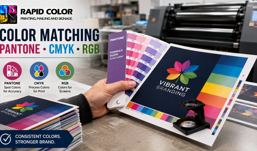
Few conversations between a designer and a printer become tense as quickly as the one that begins, “This blue is wrong.” It rarely is wrong in any technical sense. It is usually a color that exists on a backlit screen and cannot exist in ink on paper, or a brand color reproduced through two different processes on two different substrates. Color matching is the discipline of controlling those variables so a logo looks the same on a business card, a banner, and a printed box. Brands with exacting palettes often standardize on offset printing in Las Vegas for precisely this reason, and color tolerance is written into their supplier agreements from the outset.
Why Do Colors Look Different on Screen and in Print?
A monitor creates color by emitting light. Red, green, and blue light combine additively, and at full strength they produce white. Paper does the opposite. Ink absorbs light and reflects what remains, so cyan, magenta, yellow, and black combine subtractively toward black. Two fundamentally different physical systems are being asked to produce the same result.
The consequence is a gamut mismatch. RGB can display vivid saturated colors, particularly in the blue, green, and orange ranges, that CMYK inks simply cannot reproduce. When a file is converted, those out-of-gamut colors are mapped to the nearest printable equivalent, which usually looks duller. Effective color matching starts with accepting that limitation and designing within it rather than discovering it on a press sheet.
The Three Color Systems You Need to Know
RGB is for screens only: websites, presentations, and digital advertising. CMYK is the standard four-ink process behind almost all digital printing and plate work. Pantone, formally the Pantone Matching System, is a library of premixed inks identified by number, where each color is mixed to a formula before it reaches the press rather than being simulated from four process inks.
That distinction is the heart of professional color matching. A CMYK build approximates a color. A Pantone ink is that color.
How Pantone Spot Colors Work
Spot inks are the most reliable color matching tool available. A Pantone spot color is mixed from base pigments according to a published recipe, then applied through its own plate or unit on the press. Because the ink is physically the correct color before printing begins, the result does not depend on the registration of four separate screens or on dot gain across the sheet.
Spot inks deliver three benefits. They reproduce consistently across different presses and print runs. They achieve colors outside the CMYK gamut, including metallics, fluorescents, and deep corporate blues. And they produce cleaner solids, since a large flat area printed in one ink shows no rosette pattern.
The cost is real, however. Each spot color requires its own plate and press unit, which raises setup cost and normally limits spot color usage to longer runs where the investment is justified. This is why color matching strategy so often follows quantity: high-volume offset printing in Las Vegas work uses spot inks, while short-run material relies on well-built process equivalents.
Coated Versus Uncoated Pantone References
The same Pantone number prints differently on coated and uncoated stock, which is why references carry a C or U suffix. Uncoated paper absorbs ink, producing a softer, lighter result. Always specify the suffix. A brand standard that names only a number invites two suppliers to produce two visibly different results, and neither is technically at fault.
Building Brand Colors in CMYK
Most printing is process work, so the practical color matching question is how to reach the closest possible CMYK equivalent. Pantone publishes CMYK equivalents for its library, and these are the correct starting point, but they are approximations by definition. A brand guideline should therefore specify both the Pantone reference and the agreed CMYK build, so no one has to guess.
Some colors survive the conversion well. Warm reds, deep greens, and most neutrals convert with little visible loss, which keeps the process straightforward. Others do not. Bright oranges, vivid purples, and reflex blue are notoriously difficult, and color matching for those hues usually requires either a spot ink or a deliberate decision to accept a shift.
Documenting Values in a Brand Sheet
A usable brand sheet turns color matching into a lookup rather than a conversation. For each color it should list: the Pantone coated reference, the Pantone uncoated reference, the CMYK build, the RGB values for screen, and the hex code for web. Distribute that sheet to every supplier. Most color matching failures across a brand are not production errors; they are documentation gaps, where three agencies each converted the same logo independently.
Substrate, Coating, and Lighting: The Overlooked Variables
Three variables undo more color matching work than any file setting. Paper is not neutral: a warm cream stock shifts every printed color slightly yellow. A bright white sheet with optical brighteners makes the same ink appear cooler. Uncoated stock mutes saturation noticeably compared with gloss coated. None of this is a press fault, and none of it can be corrected after the fact, which is why color matching decisions should be made against the actual stock rather than a generic proof.
Finishing adds another color matching variable. Gloss lamination deepens and saturates color. Matte lamination lightens and softens it, sometimes by a visible margin on dark solids. Soft-touch coating mutes color further still. If a piece will be laminated, evaluate the proof laminated.
Lighting matters just as much as ink. Two samples that appear to match under office fluorescents can differ under daylight, an effect called metamerism, and it defeats otherwise careful color matching. Print professionals evaluate color under standardized D50 lighting for this reason. When approving a critical job, view it under consistent, neutral light rather than at a desk beside a window.
What Practical Steps Improve Color Consistency?
Five habits deliver most of the available color matching improvement. Start by specifying color properly: give your printer Pantone references with suffixes, not screenshots. Second, build files in CMYK and convert images deliberately rather than leaving conversion to the press. Third, request a hard copy proof on the actual production stock for anything brand-critical, since color matching cannot be confirmed on a monitor; a screen proof cannot show you what paper will do to ink.
Fourth, consolidate suppliers. Every additional printer introduces another press, another ink set, and another interpretation, and color matching across four vendors is meaningfully harder than across one. Fifth, keep a physical reference sample of approved work and supply it with reorders, so the target is an object rather than a memory. Rapid Color retains approved samples for repeat clients precisely because a physical reference removes argument from the process.
For campaigns that combine large-format signage, mailers, and boxes, this consolidation matters most. A packaging printing company working from the same ink standards as your literature printer will hold brand color across formats far better than two unrelated suppliers, because a packaging printing company runs corrugated and folding carton stocks that respond to ink very differently from text paper. If you are still deciding how much color to use in the first place, our comparison of color printing versus black and white sets out the return each approach delivers.
Setting a Realistic Tolerance
Perfect color matching does not exist across different substrates and processes. Professional practice works to a tolerance, expressed as a Delta E value, where a Delta E under two is generally imperceptible to an untrained observer. Agree that tolerance with your printer in advance for brand-critical work. Doing so replaces a subjective argument with a measurable standard, and it is normal practice for high-volume color printing in las vegas programs where the same logo appears across a dozen formats. Any serious color printing in las vegas supplier will measure to that standard rather than eyeball it.
Frequently Asked Questions
What is color matching in printing?
Color matching is the process of reproducing a specified color consistently across presses, substrates, and print runs. It combines correct color specification, controlled conversion between color spaces, proofing on production stock, and measurable tolerances.
What is the difference between Pantone and CMYK?
Pantone inks are premixed to a published formula before printing, so the color is physically correct when it reaches the press. CMYK simulates colors using four process inks, which approximates most shades but cannot reach the full Pantone range.
Why do printed colors look duller than on screen?
Screens emit light and cover a wider gamut than ink on paper ever can. Vivid blues, greens, and oranges frequently fall outside the CMYK range, so conversion maps them to the nearest printable equivalent, which appears noticeably less saturated.
Should I use RGB or CMYK for print files?
Always use CMYK for print. RGB includes colors that process inks cannot reproduce, and leaving conversion to the printer removes your control over the outcome. Convert deliberately in your own workspace so you can judge the result first.
Does paper affect color matching?
Considerably. Uncoated stock absorbs ink and mutes saturation, warm-toned paper shifts hues, and lamination alters the result further still. Always evaluate proofs on the actual production stock with the intended coating already applied.
What is a Delta E tolerance?
Delta E measures the numerical difference between two colors. A value below two is usually imperceptible to most viewers, so agreeing a Delta E limit in advance gives both client and printer an objective standard instead of subjective judgment.
How do I keep brand color consistent across suppliers?
Publish a brand sheet listing Pantone coated and uncoated references, agreed CMYK builds, RGB values, and hex codes. Supply a physical approved sample with every reorder, and consolidate work with as few printers as is practical.